
RESEARCH, UX & UI
Big company for the Telco Industry
The objective: Refactor the UI from an existing audio-calling product
Project Time: 3 months
Methodology: Design thinking
The Team
- UX Lead- Me (the UX/UI Owner)
- Product Manager
- Technical Lead
- Product Manager
- Technical Lead
- Developers
What I did as leader on this project
- UI Refactoring
- User-Centered Design- Sitemap (Current State)
- UX Writing
- Facilitation and Mapping:
* Prioritization Matrix
* Empathy Map
- Validations:
* User Interviews
* Usability Testing
My Toolbox
Figma
FigJam
Miro
Prototypes
Design System (Provided by the Enterprise)
Design System (Provided by the Enterprise)
How we start this time
After being in sync with the Product Owner and TL of the product, we decide to do navigate the app itself and learn about it.

The actual app "User Portal"
Gathering Insight
With an Sitemap built for the current-state and our new know-how about the product we could easily spot the most obvious function about it.

The arrows shows our primary focus --- Sitemap (Current State)
We show our findings to the PM and tell them that it will be a good idea to go to users to understands their perspective as well. He was totally agree both approach so we started to finds users.
The most common flow of a calling
In our finding also appears this flow as the most common for user in this app. This is the essential touchpoints for this product.

Is UX Research Guerilla time!
To meet the scope and deadline of the project, we did research with Friends&Family members most related to similar projects in casuals semi-structures User Interview.
The black post-its are an Affinity Diagram from the post-its below

Interviews insights - Perception/Feelings Matrix
From Data to Persona
Although this is a good set of insights, we built a User Persona to have a more digestive way to consume insights for every stakeholder in the product.

User Persona builded from our insights research | My awesome Leader did it ;)
The most important insights here are:
-->> "She's a proactive and organized"
-->> "To many apps and tools that causes a messy work"
Teamwork Workshop
We call some fellows UXers for this stage of the project
Participants in the workshop:
- UX Lead
- UX/UI Designer
- Me again (The Facilitator)
- UX/UI Designer
- UX Lead
- UX/UI Designer
- Me again (The Facilitator)
- UX/UI Designer
With our rough data, the best way we find to how prioritize was Using Affinity Diagrams and Dot Voting on a workshopping session with our UXers fellows.

Workshoping for prioritization from a UX/UI perspective based on our research
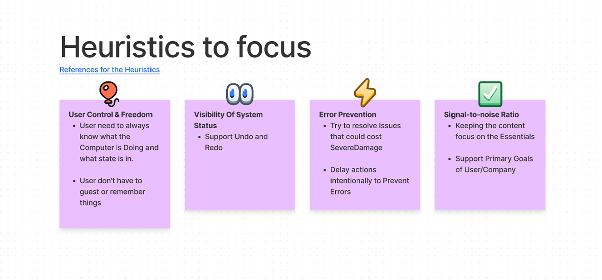
With the issues already validated we matched with the most relevant heuristics to keep them in mind while building the product:
SPACE
SPACE
“Enough about research,
it's time to Build!”
🔨
SPACE
SPACE
LowFi Prototype
To defining how our Flow of the MVP will be implementing, I build this Textbox-Prototype in Low-Fi and start the process of visual-validations with the key stakeholders, the already design patterns in our Design System and our idea of how we can create a product that is an easy-to-use for every user.

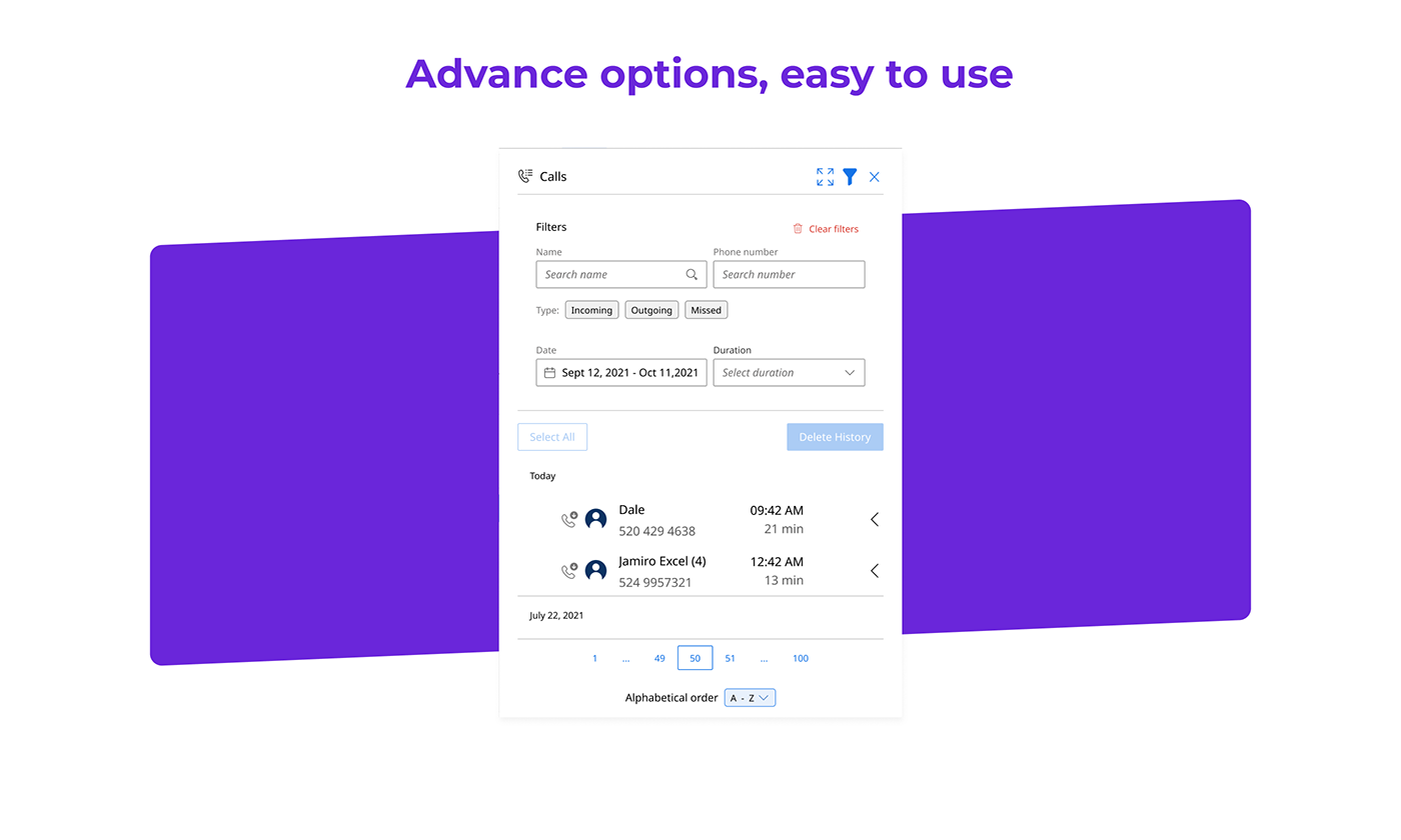
Calling Panel - The most important UI for the product
MidFi Prototype
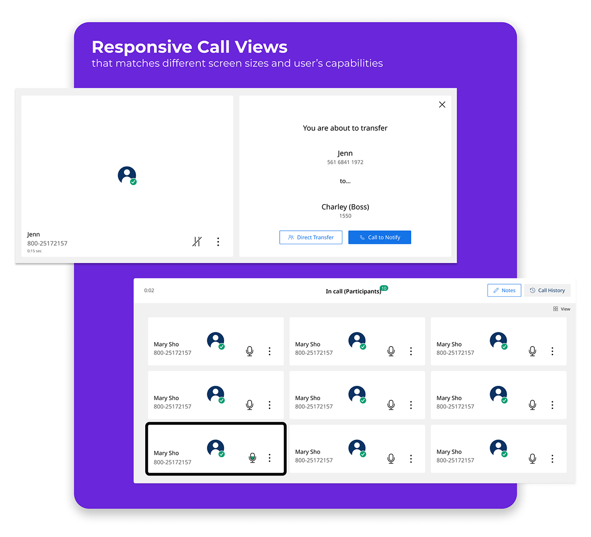
We iterated our patterns and changed to MidFi to understand more about Interactions.
Mid Fidelity Prototype - Understanding Interactions
The Final Derivable
The Figma File is ready for the handoff


One more thing: Validation
Testing the prototype
After we test our Prototype with real users (5), almost everything was fine, but we get a finding. a common one; Users prefers Labels on Icons because it give you context about what the button can or can not do (This is a known issue on UX Design).
Everything related to the icons in the navbar it was so confusing than, one of the user was scary to click the "My Recordings" button because he was thinking that it will start to cancel/start a recording and our task assigned was "Go to hear previews recordings".
Iterating
We hear our Users: 4 out of 5 users getting some problems with the icons on the navbar, and we fix it.

Minor but impactful changes for the Navbar component
Navbar iteration
1) Recording Icon: Changed
2) Config Icon: Moved to Profile menu
3) Labels added to icons
4) Understandable icons Grouped(Labels wasn't needed for users on these ones)
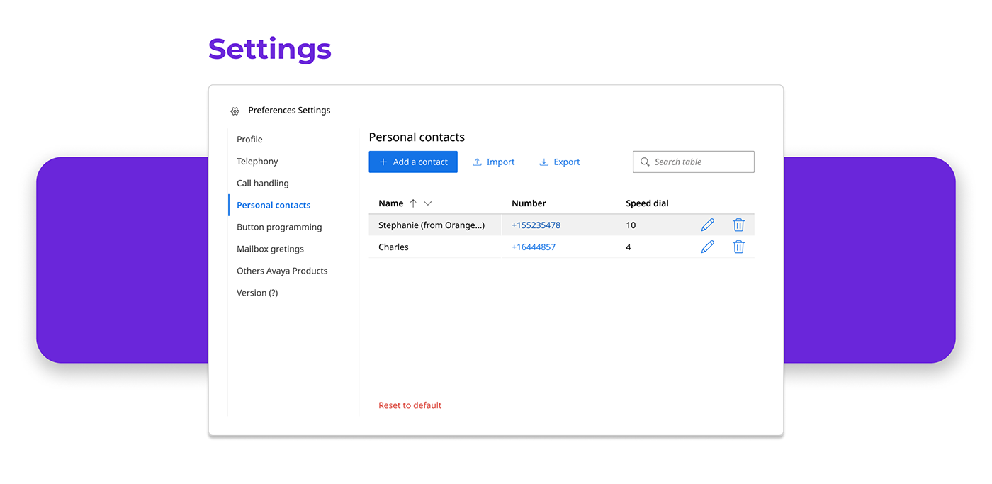
And this is how the product ended:
Clean, Appealing, and Easy to Use.
Thank you very much for reading this far!


